Last week, while I was surfing the web, I find out Readme.io has a very interesting effect. If you go to their login page and place your mouse on the password field, the owl will hide its eyes, since it does not want to see your password.
I found the thing very funny (and genial, to be honest). The most interesting thing is that replicating the effect is not so hard as it may look like at the beginning…so
Let’s create our own owl!
Basic shapes
First of all, let’s place some HTML that we will style.
<div class="owl">
  <div class="hand"></div>
  <div class="hand hand-r"></div>
  <div class="arms">
    <div class="arm"></div>
    <div class="arm arm-r"></div>
  </div>
</div>
The structure is quite simple: inside the own div we have placed 2 hands and two arms (we will see later why).
.owl
  width 211px
  height 108px
  background-image url('https://dash.readme.io/img/owl-login.png')
  position relative
Let’s explore the owl class: we’re setting the background image (kindly stolen from the guys of Readme), dimensions and position:relative. We need this explicity because we will use the absolute positioning inside. While, normally, I disagree with absolute positioning, it may have sense for complex image manipulations, as long it stays pent into a relative container.
Now, let’s style the hands:
.hand
    width 34px
    height 34px
    border-radius 40px
    background-color #472d20
    transform scaleY(0.6)
    position absolute
    left 14px
    bottom -8px
    transition 0.3s ease-out

    &.hand-r
        left 170px
Nothing of really serious is happening here: dimensions are set and thanks to position:absolute, we can set top/left properties (and override them for the right hand). The border-radius and scaleY properties allow us to create an ellipse and place it where we need.
So far, the result should be something like this:
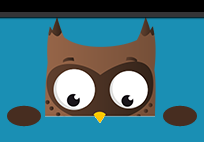
Well, with less then 25 lines of css we have done more than 50% of our job.
Placing the arms
The fun comes here. Let’s see how to position the arms:
  .arms
    position absolute
    top 58px
    height 41px
    width 100%
    overflow hidden

    .arm
      width 40px
      height 65px
      background-image url('https://dash.readme.io/img/owl-login-arm.png')
      position absolute
      left 20px
      top 40px
      transition 0.3s ease-out

      &.arm-r
        left 158px
        transform scaleX(-1)
Beside the usual absolute positioning, the clever trick is in setting the top property equal to the real image height.
This means that we are in this situation:
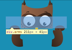
The image shows clearly that, while the arms div is positioned at eyes level, the arms are moved (using top property) below the div heigth. And, give that we’ve set overflow:hidden property, they won’t be shown unless they are in the visible area. Amazing trick, to be honest.
Animating
Well, last part is just matter of translating the arms and animate them using the animate property:
.arm
  width 40px
  height 65px
  background-image url('https://dash.readme.io/img/owl-login-arm.png')
  position absolute
  left 20px
  top 40px
  transition 0.3s ease-out

  &.password
    transform translateX(40px) translateY(-40px)


  &.arm-r
    left 158px
    transform scaleX(-1)

    &.password
      transform translateX(-40px) translateY(-40px) scaleX(-1)
Result
Done. Funny and easy, still great visual effect.
The final result can be seen here:
See the Pen Owl replica from readme.io by Vincenzo Chianese (@XVincentX) on CodePen.
The codepen has been enriched with a simple form to demonstrate the final result. However, the owl can be easily moved wherever you need.